Assignments, Design, Photography

Final Portfolio

Process: I was asked to create a slidedeck portfolio of my visual communication projects for potential employers.  I placed my creations in Microsoft Powerpoint to design my portfolio and then I saved the document as a .pdf to upload to slideshare.com.  That is an easy and great way to showcase my work! I also added a beginning and ending slide to introduce and conclude my portfolio. I wanted my beginning slide to show action and movement, but also be a creative image to represent my theme of “fitness and design.”  I found that fun orange splash image online and flipped and edited it to fit my slide page.  I also added repeating color bars and titles to each slide to introduce each project and have more design and consistency throughout my portfolio.  I wanted to match my bottom design bars to colors within my images to pull it all together.

Critique: I received critiques from my instructor, Julie Peterson, and classmates, Cristy Crawford and Susan Ruske on Facebook and in a class web meeting on July 15th.  I was very focused on aligning each individual slide, but did not think about aligning all the slides together in the bottom design bar.  That was great feedback to do that and to make my background colors flow better from slide to slide.  I went through each slide and realigned all the bottom design bars and typography and also rearranged my slides to have better flow in background color.  Great feedback!  I’m happy with my final portfolio project and excited to share it.  🙂

Image: http://tweetwallpapers.com/orange-splash-wide/

Font: Abadi MT Condensed Light and Abadi MT Condensed Extra Bold (San Serif)

Standard
Design, Photography

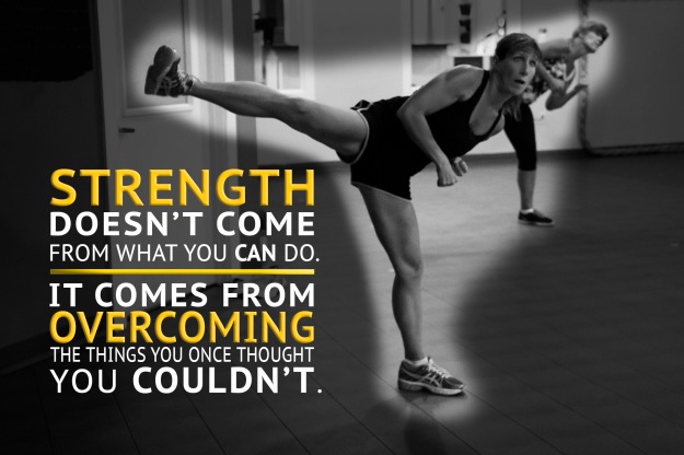
Fitness Inspiration

I’m a fitness instructor and love teaching!  My favorite part about teaching are the members.  Their real stories of overcoming insecurity, weight challenges, and other struggles are so inspirational to me!  I love pictures of real people.  Not brushed up fake, perfect models.  People embracing their individuality and working hard!  That’s perfect beauty to me.  I wanted to share some of those with you on here.  Let me know what you think.  🙂kick

sherry

conniedo

Standard
Assignments, Design, Photography

Movie Poster Project

movieposterblog

Message/ Audience: For this project we were asked to pretend that we just landed a new job and our manager asked us to create a creative and fun movie poster to introduce ourself to the employees at the next staff meeting.  Because it was for a job, I thought it would be fun to recreate the “Lucy” movie poster about the power we could have if we were able to use 100% of our brain instead of just 10% of our brain.  I would be a great employee with my super brain capabilities!  I wanted it to be edgy and captivating so I spent a lot of time getting my self image just right through blending, contrasting and making the eye stand out.

Critique Report: My instructor, Julie Peterson gave me a few suggestions to align my typography and change the bottom “June 2015” color to match my eye.  I received the same critique from my classmate, Susan Ruske.  I used the pin drop tool to capture the eye color for my bottom text and made minor adjustments in my alignment.

Fonts: Title – Lucida Grande Bold (san serif)   Body Copy – Athelas Bold (old style)   Movie Poster Condensed Font (sans serif)

Images: The image of me I took on my own with a white background to help with blending. The overlay on my image of math symbols is at this link:

http://www.123rf.com/search.php?word=25963865&imgtype=0&t_word=&t_lang=en&oriSearch=math+background

Standard
Assignments, Photography

Photographic Study Project

by Jessica Ashton

This was another difficult, time-consuming photography project for me but I am learning a lot!  It has taken me a lot of time to learn how to control and adjust my aperture, ISO, and shutter speed on my new camera.  I spent hours taking many different photos with many different settings to try and get the exposure that I was striving to achieve.   Then I had to spend time learning Photoshop and how to make a collage of photos.

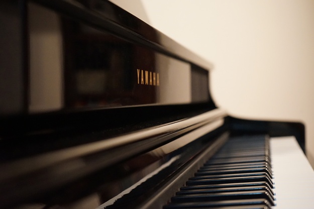
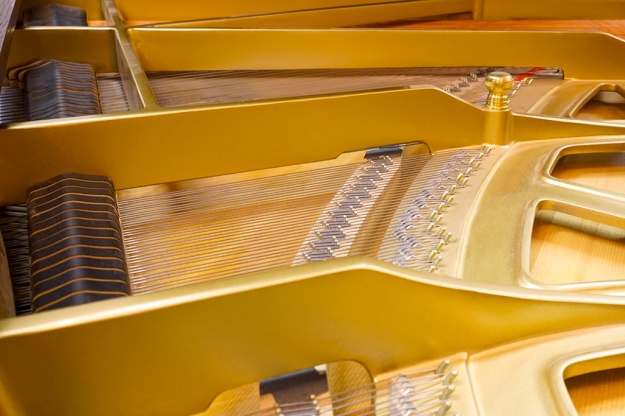
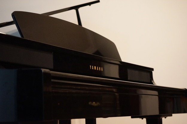
I chose my subject to by my piano, as I love music and it is a big part of my life.  I wanted to capture the many different perspectives of my beautiful piano.  In Lightroom, I slightly adjusted the vibrancy, contrast, and clarity on most of my images. Then I opened my images in Photoshop to create a collage with my various piano images.  In my last photo, I used an old paper image as an overlay to blend with my piano for a cool effect.  I liked learning how to blend images.

JessicaAshton-grid

jessashton_piano

jessashton_strings

jessashton_stringclose

jessashton_pianoboard

jessashton_piano1

old paper overlay, blending piano

old paper overlay, blending piano

Standard
Assignments, Photography

Photography Project

DSC00332

Outdoor Light

DSC00050

DSC00440-2

Indoor Light

DSC00047

Foreground Focus

DSC00048

Background Focus

DSC00361

Rule of Thirds

DSC00233

Lead Room

Photography is both exciting and frustrating!  I loved learning about photography tips with lighting and focus, however I was frustrated with Adobe Photoshop Lightroom and learning my camera settings.  The editing program kept freezing and shutting down on me.  This project took me a long time!  I took a lot of pictures and had a hard time choosing what images I wanted to use.

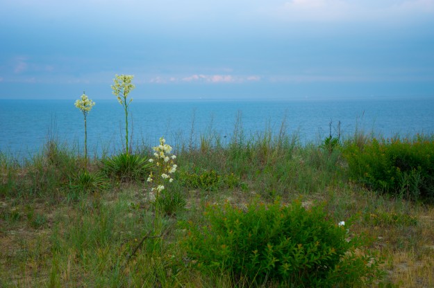
The outdoor image I took at the beach near my home.  The sun was setting and casting beautiful colors in the sky.  I liked the simplicity of the scene creating a calm, relaxing feeling.  For the indoor shot I got down and personal with my little buddy, Coal.  This picture didn’t need a lot of editing.  I loved capturing his sweet eyes.  I included a second indoor lighting picture because I wanted to try the photo painting concept with my new camera.  It took me forever to figure out the settings, but I LOVE the final result!  It was a lot of fun.  I chose the subject of “books” because I love learning and reading.

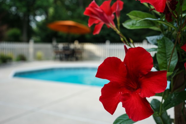
The focus foreground and background pictures I took were really fun and taken in my own backyard.  I enjoyed learning how to manually focus my camera.  I focused on the flower for my foreground pictures, and  on my patio set for my background focus.  I also tried to follow the rule of thirds in most of my pictures.  These pictures also did not need much editing.

While we were walking the beach by my house, we found this great, pink beach chair.  I thought it was so beautiful with the vibrant pink against the blue sky and water.  I liked the colors in this image so I edited it a little more to make it exciting.  The chair and the horizon is on the rule of thirds.

For the “lead room” image,  I liked the concept from our example project and wanted to try recreating it with my son.  I feel like it is not very original, but I still like this cute picture of my little boy.

Although I was stressed and frustrated with this project, I did have fun learning about photography and am excited to keep trying for more great images!

Standard