
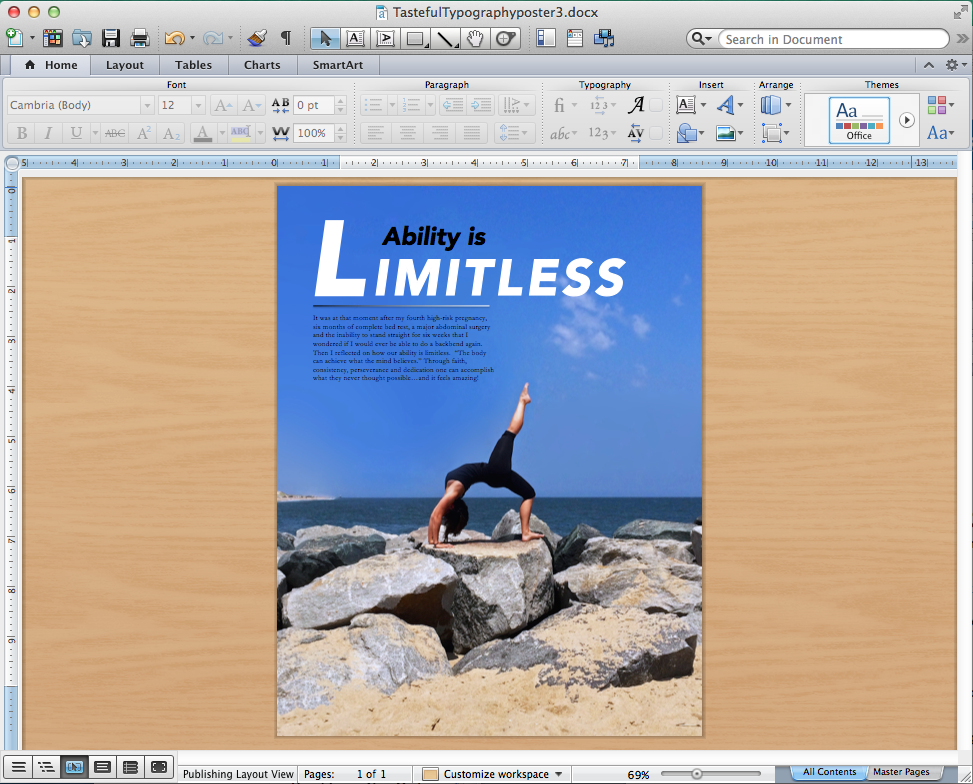
Process: I am a personal trainer and fitness instructor, but have come a long way to get to where I am now. For this project, I decided to use an image that shares my personal story with my clients and others who are doubting their abilities. My sister took this picture with her cell phone, so it needed some editing for this project. I spent a lot of time moving the clouds out of the text box so that it was more readable. I also lowered the bottom half of the picture to create more “sky” for the typography. After I made the photo edits, I placed the image into Microsoft Word. From there I made different text boxes to go on the image, as well as a design element. I made sure that I had good contrast between my title and my body copy both in color, size, and font. I wanted a strong title to reflect the strength of the pose so I used Avenir Black Oblique Font in White. For the body copy I used black Garamond font for contrast. After I had the design that I liked, I exported the image as a PDF, and saved it as a JPG through a converter online. I hope you enjoy the results!
Critique Report: I received two critiques for this project. My first critique was by my class mate Sam Merrill on May 5, 2015. I had all white text and my top text box was italicized. She suggested that my typography needed more contrast with color and also suggested that I do not italicize my words “Ability is” in the top text box. I added black and made the changes she suggested and LOVE IT! My instructor gave me a second critique and advised me to move my line design element. She said that it was breaking up the flow of the typography and needed to be moved to the left side of the photo. I really appreciate her feedback and love the changes even more! I decided to take a risk with the line and add the fade. I feel that the black fading to white line suggests that it is continues – never ending – adding to the message of the image, “Limitless.”

Wow! The final result is stunning and your story truly amazing! The line element you added and modified flows perfectly with your message. Great work…and an inspiration to me (I really needed that this week).
Check out my design at: https://cristyinfocus.wordpress.com/2015/05/14/tasteful-typography-project/.
LikeLike
Jessica! I have to agree that the final product is great. I think the gradient on the line adds a nice touch of interest, especially with your choice of words and the connection there. Sam and Sister Peterson had great suggestions and you did a great job handling them. I do like that “ability is”, & “limitless” are italicized. it flows great! Secondly, I really think you did something amazing here by sharing your story in a great piece of art. Well done!
LikeLike
https://callieannette.wordpress.com/2015/05/14/tasteful-typography-callie-meyet/
LikeLike
I think your Limitless design turned up great. It had great flow. Removing the clouds did make the words pop out better. The words are balanced very well with the photo. Nice photo too. Please take a look at mine: https://ruskeportfolio.files.wordpress.com/2015/05/4asusanruskepdf-1.jpg
LikeLike
Jessica, what a great result. I liked your confidence not only in the picture, but in your purpose in how you went about the design process. I think the risk you took with the line was well done. I do get the feel that the is moving and continuing on. Not only that but it gets lighter, sort of like how we get lighter and brighter as we press forward.
Here is the link to my blog and the project that I did. I would appreciate your thoughts. https://michellepalmatier.wordpress.com/2015/05/15/comm-125-tasteful-typography-4a/
LikeLike
I really liked the contrast you created with the typography with the black and white color as well as the size of the word Limitless. I also thought the left aligned placement works well leaving some white space to the right. The image is also perfect for your message. Love it !
LikeLiked by 1 person
Keep up the excellent piece of work, I read few blog posts on this web site and I think that your blog is very ininsertteg and has got lots of wonderful info.
LikeLike